Exciting Announcement from KH Window Fashions, Inc!

Magazine and BadgeI am pleased and proud to announce that last month, the International Window Coverings Expo in Tampa, FL honored me with first-place awards in a highly competitive contest for two different categories.

I flew to Tampa for the Awards Ceremony and Expo, where I met other talented Window Professionals and previewed new styles and hardware I can’t wait to bring to your homes.

Vision 2018 Workroom Competition:
First Place, Combination Treatments
KH Window Fashions, Inc- Workroom-Combination Treatments- After (2).jpg
Vision 2018 Design Competition:
First Place, Curtains & Draperies
KH Window Fashions, Inc- Design- Curtain and Drapery- After complete design.jpg
Awards.jpg
The VISION Design and Workroom Competition, presented and sponsored by Window Fashion VISION magazine, recognizes the industry’s best designs and fabrications in a variety of categories. This one-of-a-kind international competition is the “Academy Awards” of the window coverings industry.

Survive Summer with Sunbrella

Summer is an amazing season, filled with adventure and fun. It’s the perfect time for  outdoor BBQ’s, pool parties  with the kids, and days spent basking in the sun. It is also the perfect time to introduce Sunbrella fabric.

Sunbrella fabric is the premier option for durable, stain resistant outdoor fabric, and they’ve recently introduced an indoor line boasting those same benefits. Especially fantastic for houses with kids or pets, Sunbrella can handle the wear and tear of an exciting summer and still be ready for the next season. So if you’re concerned about your indoor or outdoor furniture surviving the summer, Sunbrella is the perfect choice for you.

What is Sunbrella?

Sunbrella is the world’s leading performance fabric. Founded in the 1960s on the belief that fabric should be both beautiful and functional, it has grown into a household name for both indoor and outdoor uses. Sunbrella fabric is extremely durable and offers a five year warranty for upholstery and a ten year warranty for shade and marine fabrics. Plus Sunbrella is environmentally sustainable.

Outdoor Fabric

UV resistant, Sunbrella has received the Skin Cancer Association Seal of Recommendation. Plus, it is fade resistant, water resistant, mold and mildew proof, and highly cleanable. It is the perfect choice for outdoor furniture, awnings, outdoor umbrellas, and boat cushions and covers.

Indoor Fabric

Sunbrella also works well for indoor fabrics. The same durability that makes it ideal for outdoor spaces comes in handy indoors, protecting your furniture from spills, pets, and children. Boasting a wide variety of colors, prints, and Textures, Sunbrella fabric is perfect for sofas, curtains, cushions, and more.

Cleaning Sunbrella

Sunbrella fabric can be easily maintained through the occasional cleaning, which can be completed in a few simple steps: 

  1.   Brush off loose dirt
  2. Spray a cleaning solution of water and mild soap
  3. Use a soft bristle brush to clean
  4. Allow cleaning solution to soak into fabric
  5. Rinse thoroughly until all soap residue is removed
  6. Air dry

However, the durability and color strength of Sunbrella fabrics mean that they can be cleaned even with bleach solutions, and the fabric retains its integrity and color.


Interested in Sunbrella? Please contact me. I’d be happy to show you the latest fabric collections. The possibilities are endless!


Clear the Clutter

Spring is on the way!

As we finally see warm weather for the first time in months, I am filled with the urge to dive headfirst into spring cleaning. Nothing welcomes in the new season like cleaning and de-cluttering your space, and I find I’m always more in love with my house when I’ve cleared out the clutter that’s built up over a long winter.
But clearing out the clutter can be a huge, overwhelming job for a lot of us. Below are some of my favorite tips for getting rid of the mess, organizing a space, and welcoming in Spring with a clutter-free home!

Five Tips to Clear the Clutter

Identify the Problem Areas
Bedrooms, kitchens, closets, and living rooms typically gather the most clutter. Figure out where your biggest messes are so you can fix them.
Make a Plan
Decide on an approach. Experts suggest either choosing a room or a category to start tackling clutter. Perhaps the kitchen is in most need of a clearing, or you’re finding unnecessary knickknacks littering every surface. Pick what you want to tackle and then make it manageable. Only de-clutter for fifteen or thirty minutes at a time. If you carve out a small chunk of time every day, you’ll have an organized house in no time.
Create Piles
As you sort through the clutter, create four piles: Keep, Donate/Sell, Trash, Belong Elsewhere (for the things that belong in another room). Place everything in the appropriate pile, and don’t be afraid to get rid of things! It’s easier to keep the clutter under control when you have less odds and ends to create clutter.
Bins, Bins, Bins
Here at KH Window Fashions, we love containers and organizational systems to give each item its place. If every item has a home, your only job is to put it back when you’re done with it, which takes a lot less time than sorting through chaotic messes to find something when you need it later. Check out some of the cool ways to store your belongings without creating clutter.
Form a Habit
You don’t want to spend every other weekend de-cluttering your home. Once you’ve gone through the hard work the first time, focus on maintaining the organized environment. You’ll be surprised how much an organized home can help inner peace. Make it a habit to avoid clutter, and then you can sit back, relax, and enjoy your beautiful home without feeling stressed.
Good luck!

Bring in the Bold and Beautiful

As we wrap up this strange hot and cold winter, it’s time to invite color back into our lives. The world outside may be dull and gray, but inside, your house can be as bright and as bold as you want.

Exciting colors freshen up a tired space. They can add cheer to both your house and your life. With bold colors and eye-catching accent pieces, a room has energy and warmth. There are so many creative ways to add a vibrant splash of color to your house. Check out a few of my favorite examples below.

Start small! Pick a few bright accent pieces to bring a new feeling to your room. Something like throw pillows or bed linens can reinvigorate a whole room without feeling like a risky investment.

Or, if you’re brightening up a small space, try adding an accent wall in an exciting shade of turquoise or tangerine.

Pick a focal point in the room and use color to draw attention to it. This can be a chair, a wall, an art piece, or even a vase. Use the color wheel to pick a shade that stands out from the other colors in the room.

Feeling bold? Embrace your new color scheme with window treatments or rugs.

It’s all about the contrast. The higher the contrast, the crisper a room feels. Less contrast presents a warmer space. Choose the one that best suits you.

Compliment those bold shades with neutral hues such as white, beige, or black to keep the color from overwhelming. Building on a neutral color lets those exciting accents stand out even more.

Remember, this is your house. Choose colors that make you happy and add cheer to your life. If you find a statement piece that you can’t live without, build the rest of the room around it. Make your home unique and a perfect reflection of you.

Autumn Accents

Life can delight you in the most unexpected of ways. Today I traveled to Boston to visit clients. On my walk to their home, I took a turn down a typical Beacon Hill road and found myself in front of a gorgeous display of Fall festivity. The residents of the neighborhood had adorned their window boxes with incredibly detailed and beautiful displays of flowers, pumpkins, and greenery. I couldn’t help but stop and admire the view, snapping a few pictures of my favorite window boxes along the way, including the one above.

Autumn is a season for beauty and warm colors, like reds, oranges, and golds. As I admire the changing leaves outside my window, I find myself drawn to some of the new Fall fabrics that reflect the changing season. Look below to see some of my favorites!

Some new fabrics from Trend!

I also love these fabrics from Fabricut.

And Stout recently released some beautiful gold fabrics!

Plus check out these Fall reds from RM Coco.

Let me know what your favorite is too.

Power Up Your View

These days everything can be controlled by technology. You can adjust your heat, even when outside your house. You can set automatic lights to make an empty house look occupied. You can even turn on a cooling fan remotely. So why not your blinds?

Did you know you could lower your blinds at home in Massachusetts while enjoying a relaxing vacation in Florida? With today’s newest advances in motorization, it is possible to sync your blinds with anything from a wall remote to a handheld controller to your personal device, be it phone or tablet.

Today I attended an amazing seminar by Hunter Douglas, learning the ins and out of window blinds motorization, and I’m really excited to share my new knowledge with you. So read on and enjoy seeing how this new technology brings about intelligent shades that simplify your life.

What are the benefits of switching to motorized blinds and shades? 

  • Precise Operation – precise control of various products, whether up, down, tilt, or traverse
  • Flexible Schedules – with the PowerView App, you can schedule the exact movement of your shades to occur automatically
  • Energy Efficient – link to sunrise and sunset times as calculated by PowerView to control solar energy or wake with the sun
  • Security – adjust shades while you are away with RemoteConnect on your smartphone or tablet
  • Child Friendly – battery-powered and cord-free, the operation is both aesthetically pleasing and safe for children and pets
  • Diverse – contains the widest array of innovative styles, colors, and fabrics
  • Battery Powered – this makes them easy to install, operate, and maintain

How it works:

  1. Start with a PowerView Pebble, the handheld control and entry point for the entire system. Both elegant and simple, it is the  perfect union of form and function to operate your shades on command without lifting more than a finger.
  2. Prefer a convenient fixed location to operate your shades? Simply opt for the Surface Remote which has all the same features as the Pebble Remote, only it remains solidly fixed to the wall.
  3. Explore direct control from your phone or tablet. Activate the PowerView App, and enjoy sending shades to specific positions and levels with a swipe of the finger. Simply create Rooms on the app, add your shades, and make a selection, adjusting one or even all of your shades with ease.
  4. Set your Scenes and decide which Rooms you want operating independently or in total synchronization, from raising the bedroom and kitchen shades in the morning to adjusting the living room shades in the afternoon to lowering all the blinds in the entire house at night. The choice is yours. Individual Rooms and Multiple Room Scenes can be controlled to activate a host of movement throughout the house with a single press.
  5. Enjoy RemoteConnect which allows you to activate Scenes from anywhere in the world via your phone or tablet on the PowerView App. RemoteConnect works through a secure Hunter Douglas server to keep your home safe and protected.

Take control of your home like never before and let intelligent shades simplify your life.

Introducing the 2016 Color of the Year

Happy New Year!  Every January,  I look forward to writing my newsletter and unveiling to you  the NEW color of the year.  Since 2000, the Pantone Color Institute has been designating a color of the year to  express in color what is taking place in the global trends. This year, in an unprecedented event, Pantone has announced two colors for 2016: Rose Quartz and Serenity.

These colors are to act as an antidote to modern day stresses by being welcoming shades that psychologically fulfill our yearning for reassurance and security.

Separately, each color brings in something different. Rose Quartz is a persuasive yet gentle tone that conveys compassion and a sense of composure. Serenity is weightless and airy, like the expanse of the blue sky above us, bringing feelings of respite and relaxation even in turbulent times. And when joined together, Rose Quartz and Serenity promote an inherent balance between the warmer embracing rose tone and the more tranquil cool blue, giving us order and peace.


There are many beautiful fabrics and trims to choose from.  Get a window treatment for your bathroom or toss a few new pillows on to your sofa or bed.

If you choose to embrace the Rose Quartz side of the spectrum, try a nice splash of Rose Quartz with accents and accessories in neutrals, like decoration in the Melbourne restaurant Entrecôte pictured below:

Or consider leaning towards the baby blue of Serenity for more of a neutral approach while still maintaining the desired aesthetic. Check out the example below:


Here are some great decorating ideas to incorporate the colors into your household.

Want to see more fun ideas? Check out our Pinterest board for other exciting ways to decorate and accessorize with the new 2016 colors. Happy New Year!

Elegant Embroidery – It’s All in the Details

Recently the lighting store, Patti Bros, contacted me about an opportunity to showcase some examples of my window treatments on their windows in their newly renovated store. For the past several weeks, I’ve had a phenomenal time picking out fabrics, trims, and treatment styles to display on their windows. Each treatment ended up being a different style, giving me a chance to really get creative.

The center display, however, gave me the chance to do something new: add personalized embroidery to a window treatment.Finish Relaxed Roman

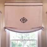
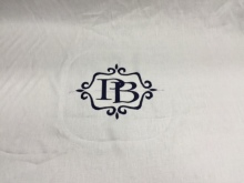
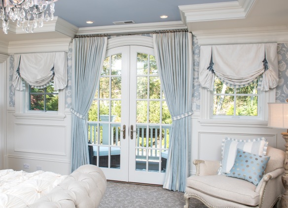
I decided on a Relaxed Roman for that window, which is a simple but elegant design that perfectly showcased the Patti Bros. emblem I had embroidered on the center. The process to add personalized embroidery to the Roman was a surprisingly pleasant and easy experience.

embroidery spools
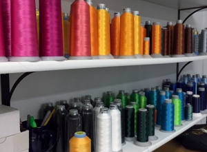
Step 1 – I went to the embroidery shop to pick out the thread color. There were so many different choices! Luckily I already had an idea of what I wanted and just needed to find the perfect shade.

Computer embroidery
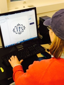
Step 2 – We tweaked the potential design on the computer and added decorative scrolls to the emblem to dress it up. Then it was time to make a sample!

sample
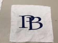
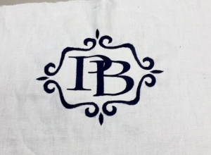
Step 3 – We created a few samples to make sure we had exactly what I envisioned.

close up machine
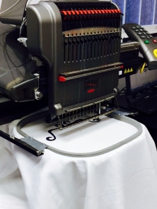
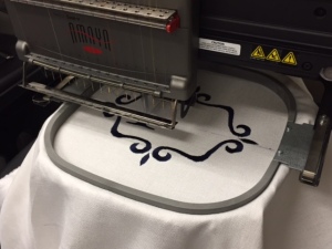
Step 4 – The embroidery machine created the emblem on the center of the Relaxed Roman fabric.

Once the emblem was made, there were still a few things I had to do myself, like add blackout lining to the fabric to keep the embroidered design clear and beautiful despite the sun’s strong rays. Then I used the fabric, keeping the emblem centered, to make my finished Relaxed Roman shades. The shades are now installed at the Patti Bros. shop and I love the way they immediately draw your eyes when you enter the shop. The embroidery just sets off the whole design and makes it pop.

Here’s what it looks like in the shop:

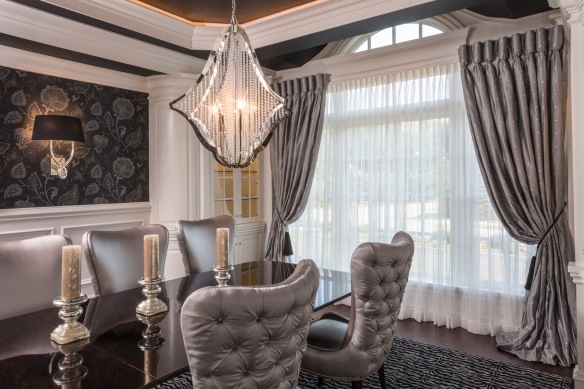
But embroidery doesn’t have to be limited to window shades alone – you can embroider valances, pillow shams, pillows, shower curtains, and more! The possibilities are endless!


Take a look at a few more “Behind the Scenes” pictures of the embroidery process below!
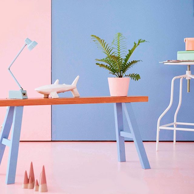
sample 2finishedembroidery machine

The Psychology of Colors – Black, White, and Brown

As the month of April wraps up, it is time to wrap up our series on the psychology of colors with one last post.

Brown, White, and Black are essential colors, and it’s nearly impossible to decorate without them. So what do each of these shades say? Let’s take a look.

Black black

Often a favorite color for clothing, black brings power and sophistication. Black evokes potential and possibility with an air of mystery. It is an elegant color, but too much of it while decorating is overwhelming and can darken a space. Use black sparingly, and you’ll be sure to add grace to any room.

White white 2

People typically associate cleanliness and purity with white. It is a fresh, bright color that opens a space and creates a very meditative and settled feeling. White is a very neutral color and works well with another color to accent and liven up the space.

Brown brown

Brown is a very sincere and stable color. The rich, earthy tone brings a feeling of orderliness and can be used as a grounding color. Brown is a color of nature and brings that atmosphere into the room. It works best as an accent color and compliments many different shades on the spectrum, bringing warmth to any room.

Which of these is your favorite? Did any meanings surprise you?

paint-splash_163112

The Psychology of Colors – Greens, Blues, and Purples

Spring is here! Everywhere around me, I see crocuses and daffodils and tulips. purple_crocuses_flowers_spring__free_download__one_million_wallpapersGreen shoots are coming up on every available patch of soil. After this winter, flowers are a welcomed sight.

All the bright greens and blues and purples surrounding me remind me of all the interesting psychology behind them. So for our Part Two of the Psychology of Colors, let’s talk about the power behind some of my favorite spring shades.

greenGreen

Nothing says spring and new growth like the color green. As the most pervasive color in the natural world, and the easiest color for our eyes to see, it exists as a favorite color, second only to people’s love for blue. In fact, green was George Washington’s favorite color. Green relaxes you through and through, both mentally and physically with its soothing shades. It can help alleviate depression and anxiety while offering a sense of renewal. This color can be used for any room, as it carries a sense of balance and freshness.

Blue blue

Blue is the most universally favored color – and the most gender neutral too, as it is liked equally between men and women. Blue is a cool, spiritual color that promotes a sense of calm and peace. It also brings about a feeling of trust, and people are more productive in blue rooms. Fun fact: the most popular color for toothbrushes is blue. Just like green, blue is appropriate in every room, and can make a space feel very restful.

Purple

real purpleConsidered a royal color since the Caesars ruled, purple uplifts and inspires creativity. Purple has both the stimulation of red and blue’s calm in a perfect balance. It is often favored by very creative people for it’s mysterious whimsy. A lighter purple, such as a lavender or aubergine works well for a bedroom or powder room or even a living room to calm nerves. Kitchens benefit from brighter purples, which are reminiscent of fruit and make the room exciting.

It is so interesting to learn about the psychology behind each color. Have you ever noticed any of these colors affecting your mood? Which one is your favorite? Stay tuned for next week when we tackle the monochromatic shades of the color spectrum – white, grey, brown, and black!

paint-splash_163112